ET-Jekyll theme
Jan 14, 2018
ET-Jekyll theme is based off of Dave Liepmann’s awesome Tufte CSS - which takes its style and inspiration from the wonderful book and handout designs of Edward Tufte.
The differences are subtle when comparing my variation to Tufte CSS, but these changes were made out of personal preference and are not in any way “better”. If you prefer the original CSS styling - please use it!
Setup
To use ET-Jekyll, simply download the files off Github and run the build as you would any other Jekyll site:
jekyll serve
You’ll want to make edits to the _config.yml and Gemfile for core setting changes. For navigation, heading, footer or post layout changes - edit the corresponding HTML files in the includes folder.
That’s it for setup!!
Structure & Elements
ET-Jekyll makes everything extremely easy for you to start writing content immediately. Simply write your posts in markdown and the theme will handle the rest.
For best results, try following the writing design standards below:
Headings
Blog post titles automatically use the h1 heading followed by a subtitle classed paragraph tag for the date. Proceeding section headings use the h2 tag and lower level inner-headings use the h3 tag. As stated in the original Tufte CSS documentation:
More specific headings are not supported
If the mood strikes, you can always use the caps class to make the first set of words small-caps for new section headings. This should not be done in conjunction with the regular h1, h2 heading structure. Stick to one or the other for reader consistency.
Text & Links
Write your content using regular markdown structure for paragraphs, unordered / ordered lists, blockquotes, links, and code snippets. ET-Jekyll takes care of everything for you:
Unordered List
- List item one
- List item two
- List item three
Ordered List
- List item one
- List item two
- List item three
Blockquotes
The minimum we should hope for with any display technology is that it should do no harm.
The public is more familiar with bad design than good design. It is, in effect, conditioned to prefer bad design, because that is what it lives with. The new becomes threatening, the old reassuring.
Links
Text links are set to the same color as the rest of the base content, as not to distract from the flow of reading. The text-decoration is set to underline which allows the interactive element to stand out without drawing the reader’s attention away from the content itself.
Code Snippets
library(lattice)
x <- mtcars$wt
y <- mtcars$mpg
xyplot(y ~ x, xlab="Car weight (lb/1000)", ylab="Miles per gallon of fuel",
par.settings = list(axis.line = list(col="transparent")),
panel = function(x, y,...) {
panel.xyplot(x, y, col=1, pch=16)
panel.rug(x, y, col=1, x.units = rep("snpc", 2), y.units = rep("snpc", 2), ...)})
Math Equations
ET-Jekyll uses MathJax for placing mathematical equations inline within your content.
When (a \ne 0), there are two solutions to (ax^2 + bx + c = 0) and they are
\[x = {-b \pm \sqrt{b^2-4ac} \over 2a}.\]Tables
End of year device distribution by percentage
| Devices | 2016 | 2017 |
|---|---|---|
| Medium phones | 44 | 55 |
| Phablets | 41 | 55 |
| Full-size tablets | 8 | 6 |
| Small tablets | 6 | 4 |
| Small phones | 1 | 0 |
Sidenotes: Footnotes and Marginal Notes
On larger viewports, sidenotes and marginal notes are placed into the far right column so the reader avoids eye-jumping around the page to find the corresponding content. On small viewports these notes are placed under it’s parent content. This is an short example of a generated sidenote.
Try resizing your viewport to see the design change in action.
Why no toggle?
The original Tufte CSS hides sidenote and marginal note content on smaller viewports until the user toggles them into view. Although this approach is pretty and keeps the overall design clean, it’s best not to sacrifice user accessibility over a slightly cleaner presentation.
Figures
You’re welcome to simply use an img element when pasting in static content to your articles, but a figure element with included marginal notes is preferred.
Also remember to add the loading="lazy" attribute to all image elements to help improve initial loading performance.
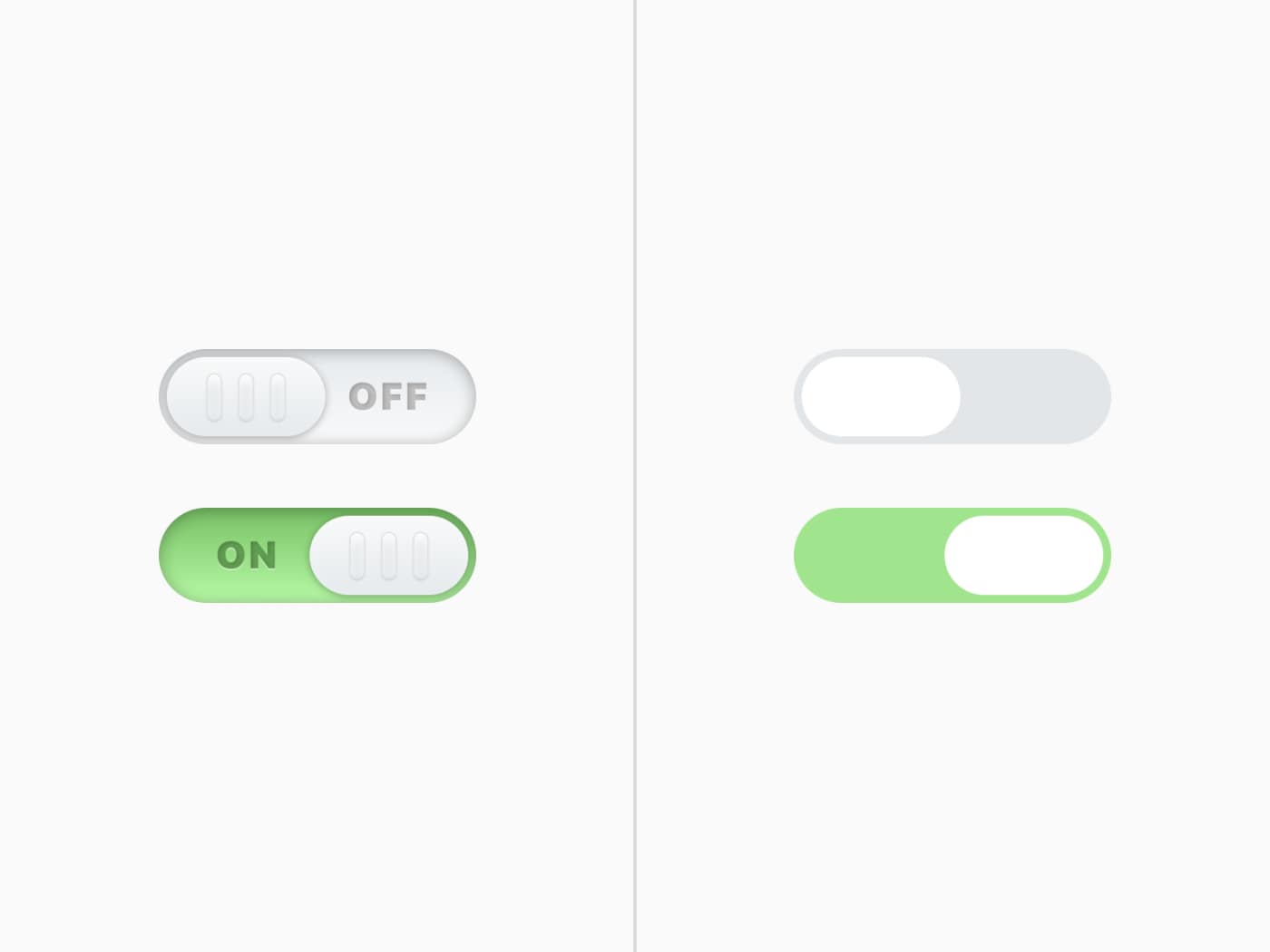
 User interface toggle comparison between flat and skeuomorphic design by Bradley Taunt.
Performance
Using font-display
ET-Jekyll theme uses Bram Stein’s FontFaceObserver script which adds a fonts-loaded class to the document html only once the custom typeface (et-book in this instance) is loaded. Doing so prevents FOIT and ugly content pop-in on slower connections.
ET-Jekyll now uses the font-display property to swap out the custom typeface. Less JS and simplicity is always a good thing.
// Keeping things simple
font-display: swap;
CSS File
All styling for this theme is loaded inside the style.css file (compressed by default). This ensures the main structure, layout and core elements of ET-Jekyll load instantly and avoid even further “pop-in”. The et-book typeface is pulled in from the /fonts directory which helps cache and avoid FOUT.
Any design changes should be made to the style.scss file inside the root directory.
Final Thoughts
This theme is an open source side project by Bradley Taunt - made with passion and care. Edit, improve, customize or butcher this theme as much as you’d like. If you spot an issue or find a better solution for any user pain-spots, please don’t hesitate to open a PR with your changes.
Enjoy ET-Jekyll!